|
1)what is art? Art is a tangible form of expression that evokes emotions from the artist and viewer/s.
7)what was the point of this class and what did you learn from it? The point of this class was to make art and periodically over time improve your skills and increase your knowledge of art. I learned numerours styles and terms that I had no idea existed before and definitely improved my skills since day 1. (I know this isn’t a part of the question but I had a really good time in art it was mad therapeutic to paint early in the morning 10/10 would totally recommend to a friend because you’re a cool teacher.) 9)Illustration Fridays have been completed almost every week this semester, do you feel this assignment helped you brainstorm for main project or helped you skill levels in any way? Why, or why not? Illustration Friday’s were not helpful to me in planning or brainstorming for any projects because they had a set theme which never ended up relating to anything I created. They were also not helpful because a majority of the time I forgot to do them so the lack of usefulness could be due to user error.
0 Comments
the art criticism process is when the viewer evaluates a piece of art and gives their opinions, and helpful criticism to help the artist in the future on how they can better their pieces. They evaluate the composition, medium, value, texture, hue, etc. of the piece. 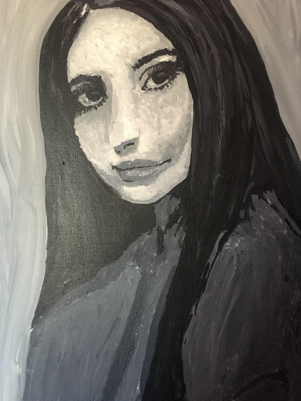 we were supposed to pick an older piece but I chose my last project where I painted a self portrait of myself. I used a photo editing app to turn my picture into “poster mode” and then printed it out and used a grid to help me draw on the canvas. Throughout this process I messed up the grid about 5 times so my canvas had a plaid pattern which made it very difficult to know which boxes were which (despite highlighting them in different colors) so I eventually got fed up and went free hand which resulted in my portrait looking like an off brand version of myself but it still looks nice. After that I painted the basic layers and ended up using different shades of grey mixed with white and black and used a stippling effect to add texture and depth to my piece. After that dried I then went in with lighter greys and white and blended the values to contour my face. What I learned from this was how to shade and blend values in the face to make it appear more 3D or realistic despite using a textured style. I also learned how to grid properly after many failed attempts and how proportions and angles play a large part in making a portrait piece accurate. Overall I enjoyed the outcome even though I’ve been told that it looks like Lana del Rey and Kim Kardashian and nothing like me at all.
finished product 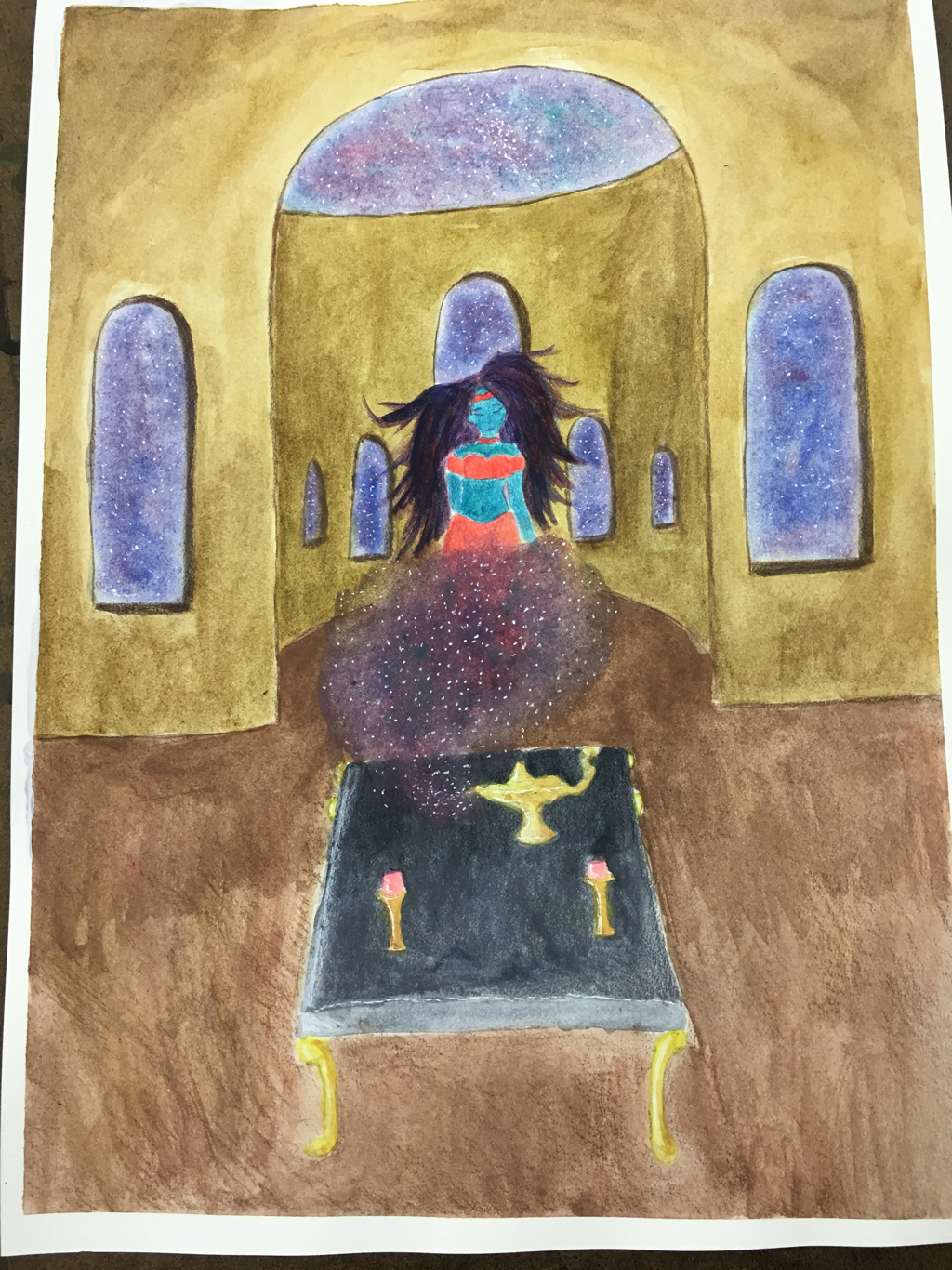 thumbnail sketches 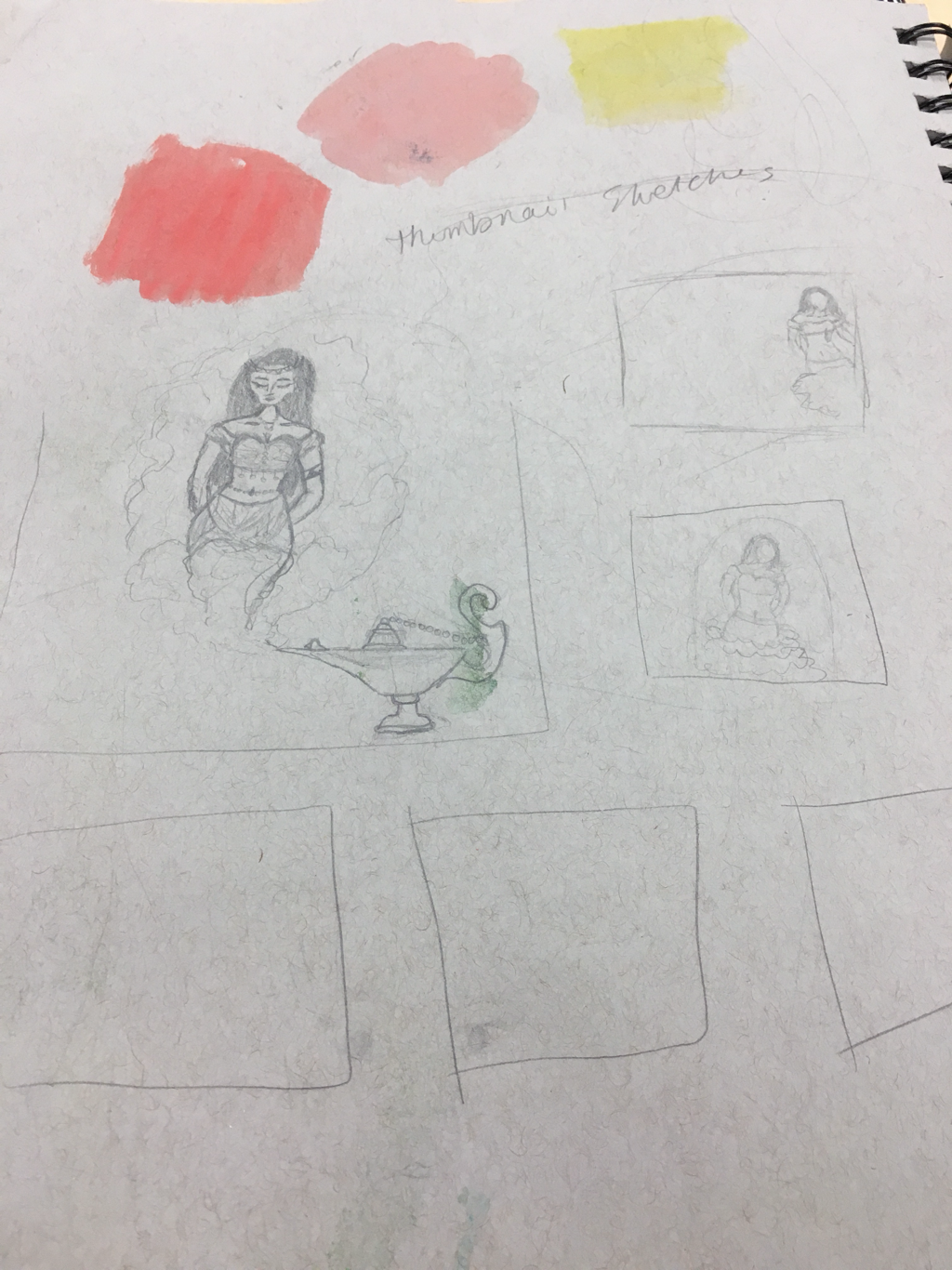 Most helpful warmup: the most helpful warmup for me was when we had to recreate a page from a cartoon book because it taught me how to use different techniques. mind map 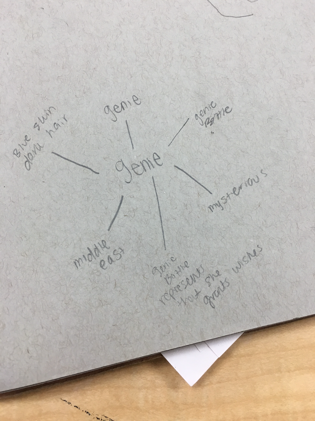 my design differs from other artists because I chose to change the gender of the genie from male to female.
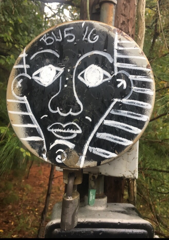
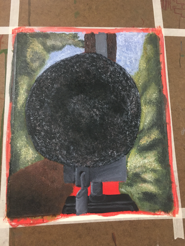
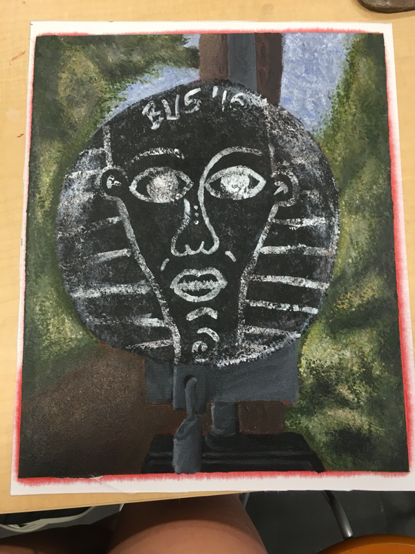
process: after sketching everything out I just painted multiple layers. After those dried I went over some spots and shaded to add value with prismacolor pencils and then went back over that with a few more layers of watercolor. After that was done I used white gel pen to make stars. What I would recommend to someone using this medium is to go from lightest to darkest because I didn’t and the dark colors bled through and it made everything look messy. Hue value scale 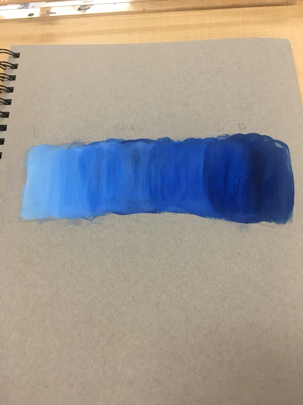 Most helpful warmup 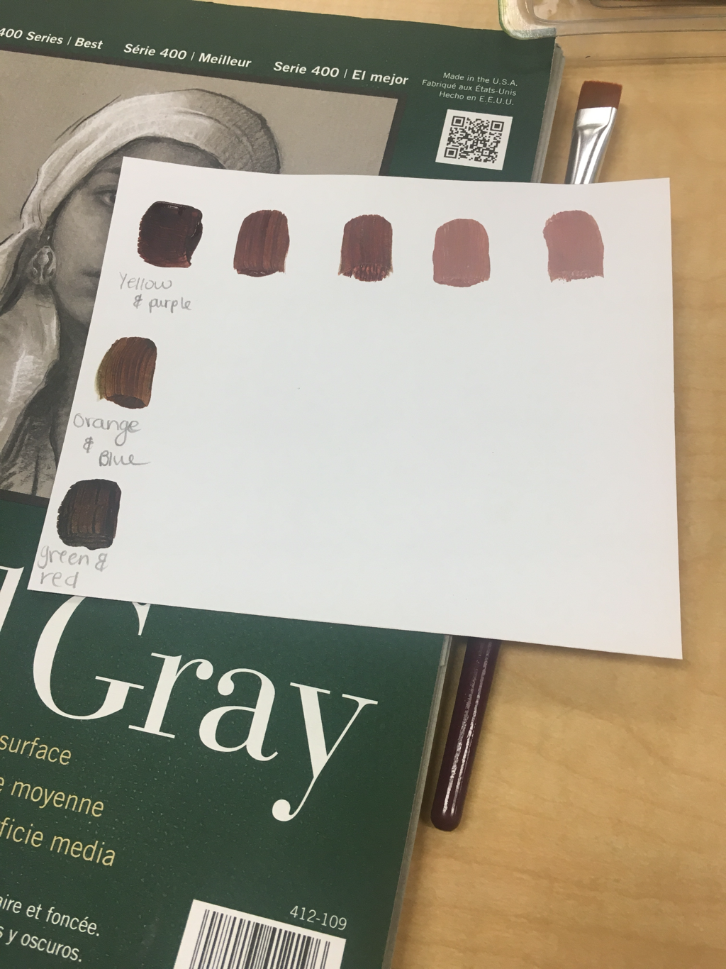 for me the most helpful warmup would be the brown swatches because it taught me how to mix different shades of brown depending on what colors I mixed. This was helpful for the idea of place unit because in my project brown was used a lot. (Left to right) reference image, in progress, finished piece The place where my piece is is the railroad tracks behind the old Apex high school. I chose this place because I had a lot of good memories there and I specifically chose this picture because I like graffiti. The most challenging thing about this piece was the angle in which I took the picture and trying to recreate that on the canvas. The most successful thing about my piece was the style I used. I used stippling throughout the entire piece to create layers and texture. Process: i filled in the black circle and the background with their base color. (Sky I used blue, trees green, etc.) after that dried I painted the face onto the circle and while I waited for that to dry I used different shades and stippled the trees and sky. While I waited for those to dry I went back over the face with black and grays and used the same stippling technique to make the paint look worn. After the sky, ground and trees dried I went back over them with the base color to help blend and make things look less harsh.
my mentors name is Danyelle and she works mainly with watercolor. Blog: artlingcorner.weebly.com What I want to learn from my mentor is mostly techniques on how to make my pieces more realistic no matter what medium I'm using. Color mixingTested colors   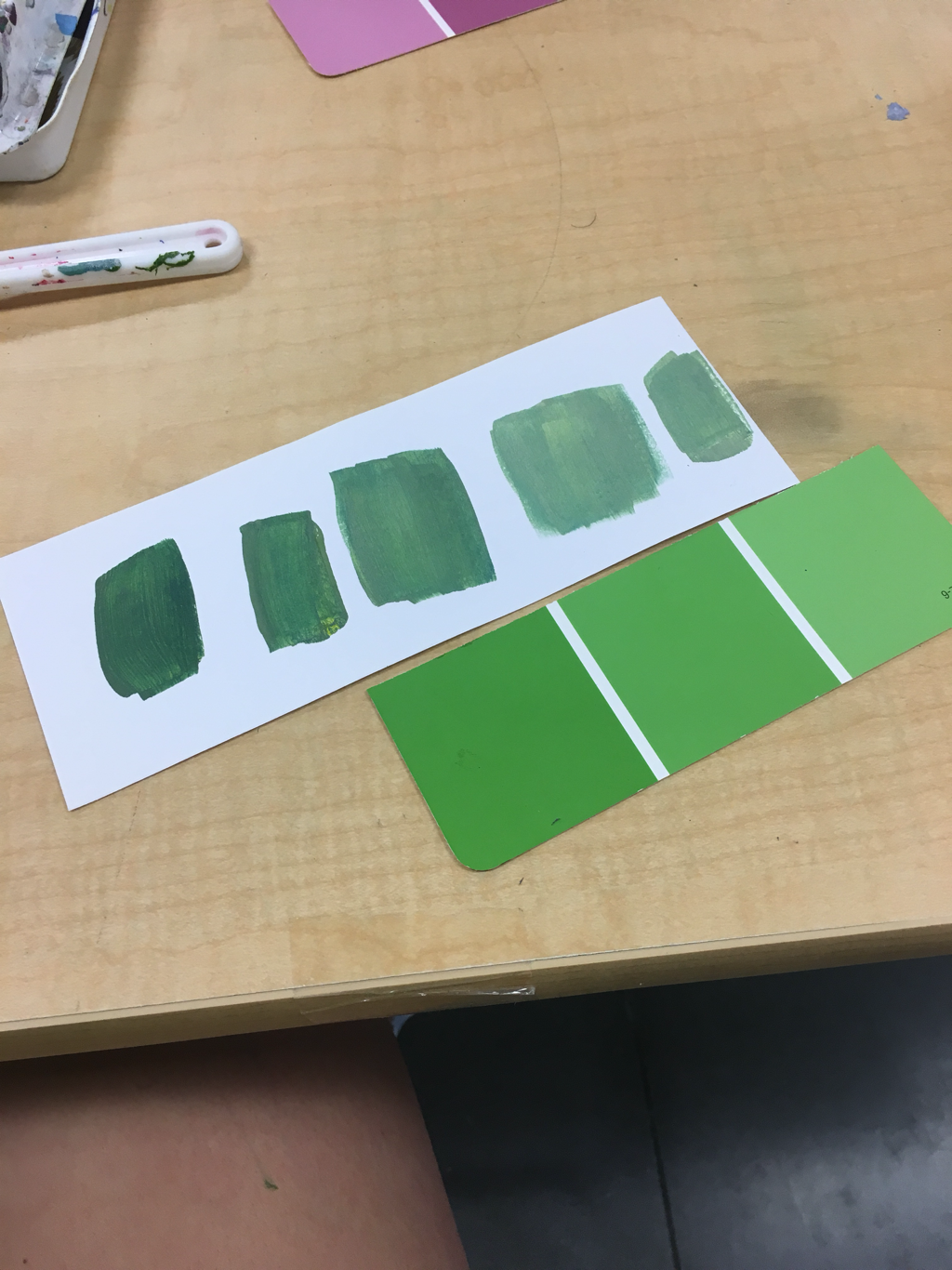 from this activity I learned that you have to keep adding white or black to make the color darker or lighter and that sometimes it's too much and you have to start over completely. Brown swatches  How to make brown:
combine red and green, orange and blue, or purple and yellow to create different shades of brown. Thumb nail sketches  Reference images 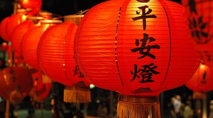 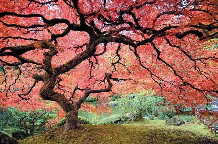 Finished piece 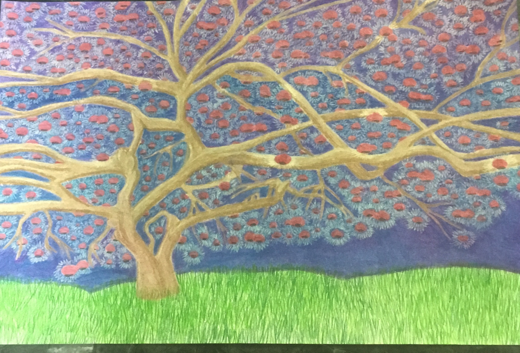 for the two in one project I combined Chinese lanterns (as leaves) with a Chinese maple tree In progress 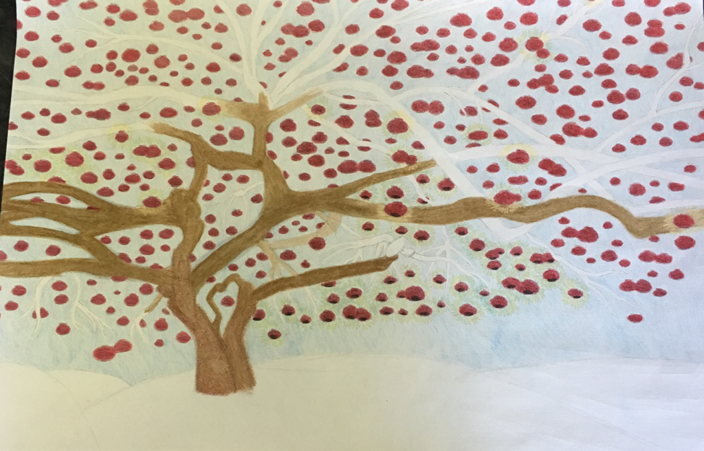 Detail shot 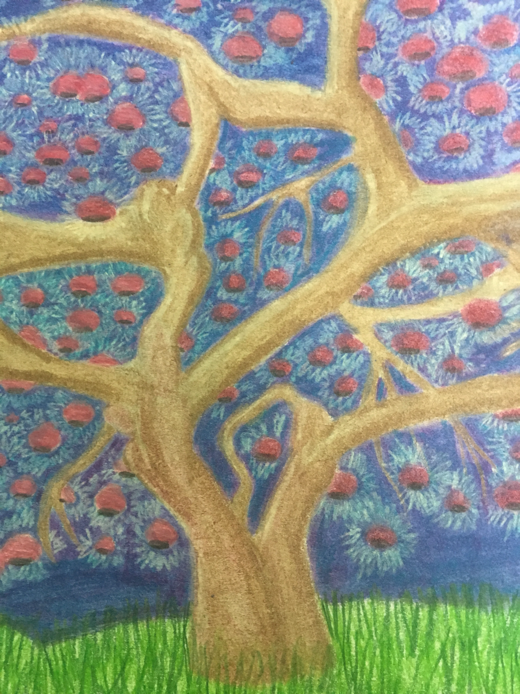 I chose the detail shot to be of the trunk of the tree and some of the branches near it bc I'm very happy with the shading that I did More about the pieceMedium: colored pencil
Process: I began by sketching out the tree and all of the individual lanterns. Afterwards I colored in the sky and the trunk and lanterns. After coloring I used baby oil and a q-tip to blend. After that I added more value with colored pencils on top when it finished drying Bic ballpoint pen portraits on vintage maps and stationary by Mark Powell 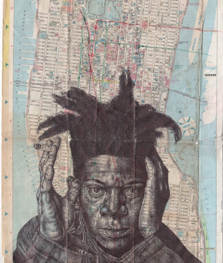 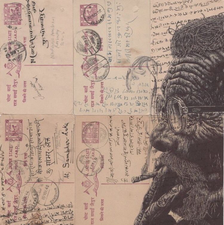 About
Born: 9/4/1968 in Illinois but currently lives in Mexico City -member of the In-public street photography collective Medium:pen Website: Markpowellartist.com instagram:mark_powell_art I chose Mark Powell for my inspired artist because he combines photography and pen which is my favorite medium and photography is something I'm interested in. He inspires me because his work is unique and diverse. He photographs different people of all ages and races and draws them with fine detail onto vintage maps which is creative which shows that he's inclusive and patient and that is why I chose him for my inspired artist. |
 RSS Feed
